contact sheet.
Harmony & Economy.
I have a good friend in my church. We sing together on the Praise Team in the contemporary service. She's a lot older than me, and got married on Saturday. I was invited. At the end of the reception, we got little jars of jam and Hershey kisses with her and her husband's initials; Maggie and William Kleinot. The jam has a special meaning from her childhood.
Harmony, Emphasis, & Craftmanship.
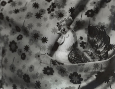
My mom absolutely loves roosters. She inherited that from my grandmother, who decorated her home with the birds. My mom has a lot of her old statues and such. I slipped the statue into my mom's pocket of her nurse scrubs. The flowers bring it together but emphasis is on the bird. The rule of thirds is there as well.
Blog
Wednesday, June 5, 2013
Monday, June 3, 2013
Hockney
This is the lamppost in my front yard. My mom loves statues, and we have several in the yard. This one of a little girl and a basket is especially cute. I crouched down so it kind of looks like you're looking up at the post.
Thursday, May 30, 2013
Friday, May 17, 2013
Digital 14--Principles of Design
Balance 1
Craftsmanship 1
Craftsmanship 2
Economy 1
Economy 2
Dominance 1--This is my beautiful kitty Charlie. He was sleeping, so i got down on the ground and began shooting. Charlie woke up and i got some adorable pictures of him reaching for the camera, but i love this one because you just have to look at him.
Balance 1
Dominance 2
Harmony 1
Harmony 2
Movement 1
Movement 2
Proportion 2
Space 1
Proportion 1
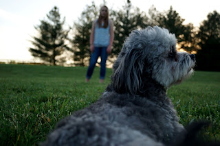
Space 2--I love this picture so much. I was attempting to photograph my sister when our dog, Henry, decided to flop down in front of me on the grass. I was already laying down, so i quickly focused on Henry and managed to catch this shot before he moved away. There is no intersection between Sarah and Henry, showing a good use of space.
Variety 1
Variety 2
Craftsmanship 1
Craftsmanship 2
Economy 1
Economy 2
Dominance 1--This is my beautiful kitty Charlie. He was sleeping, so i got down on the ground and began shooting. Charlie woke up and i got some adorable pictures of him reaching for the camera, but i love this one because you just have to look at him.
Balance 1
Dominance 2
Harmony 1
Harmony 2
Movement 1
Movement 2
Space 1
Proportion 1
Space 2--I love this picture so much. I was attempting to photograph my sister when our dog, Henry, decided to flop down in front of me on the grass. I was already laying down, so i quickly focused on Henry and managed to catch this shot before he moved away. There is no intersection between Sarah and Henry, showing a good use of space.
Variety 1
Variety 2
Friday, May 3, 2013
Digital 13--Elements of Design
Form 1--My mom has a ton of these little statues. We give them to her for birthdays, mother day, and Christmas. They mean a lot to her and to us. I set up this stature near the window to get good shadows.
Shape 2--This is a glass portrait of a horse. I keep it in my window, and during the day the light shine through to show the horse. It's a flat piece of glass, but it looks 3-D. I think it's really interesting, and framed by the window pane.
Line 1--This is one of my horse back riding awards. It's one of the best you can get, and I'm really proud of it. I dropped it on my floor and it created a nice pattern, with a nice diagonal line.
Line 2--These catterpillars are so cute! Except for the fact that they destroy trees. Anyway, they're really challanging to photograph because they're always moving. They have nice lines though.
Shape 1--These are on my wall, and they're handpainted. I really love these things. They're so interesting. And they're flat, so they work well for this.
Form 2--Flowers in my yard. They're really pretty, but the bees were scary. I got the shot and ran. The sun makes it look very three-d and solid.
Texture 1--The dust on these leaves make them look soft and rough at the same time. The light was perfect, so i set up and took the shot.
Texture 2--This is a wreath in my hallway. It's very textured, with the beads on the berries on the branches on the circle. The light was a little flat though.
Value 1--I keep this plant on my bedside table. i though the light was really nice. Half of it is darker, and the other bits are really bright.
Value 2--I thought this was really cute. It's our childhood play ground, and it's half buried in the trees. the lights and shadows are nice and very interesting.
Thursday, May 2, 2013
Digital 12--Splash of Red
My barn has bunches of different flowers out front. These flowers are still perfect, while some others are wilted. Although it's not exactly red, purple is made from red and the flowers still catch your eyes and create a center of interest.
I have a Japanese maple in my own yard, but this one is much brighter. It's at my barn--which you can see, the building in the background--and it really drew my attention. It was quite a windy and dark day, so i had some trouble stopping the motion of the branches.
I have a Japanese maple in my own yard, but this one is much brighter. It's at my barn--which you can see, the building in the background--and it really drew my attention. It was quite a windy and dark day, so i had some trouble stopping the motion of the branches.
Tuesday, April 23, 2013
Film 7--Dramatic Lighting
My mom has this dogwood in our front yard. I like this picture because it's an interesting perspective. I stood behind the flower and shot into the sun. I really love this tree--it's always gorgeous in the spring.
Contact Sheet
This is the mask my aunt gave me. I like this shot because it looks kind of creepy. (the fear of masks is called maskaphobia, by the way. and the fear of clowns is coulrophobia.) This is an interesting piece that also uses the rule of thirds.
Contact Sheet
This is the mask my aunt gave me. I like this shot because it looks kind of creepy. (the fear of masks is called maskaphobia, by the way. and the fear of clowns is coulrophobia.) This is an interesting piece that also uses the rule of thirds.
Subscribe to:
Comments (Atom)


.JPG)
.JPG)
.JPG)
.JPG)
.JPG)
.JPG)
.JPG)
.JPG)
.JPG)
.JPG)


